Hello! This is VPLATE. ✌
Continuing from our previous topic on 'product pages', we're diving deeper into the same subject today. In the first installment of our product page series, we covered 'Top 5 Tools for Creating Product Page Content', and in the second installment, we discussed '4 Secrets to Product Page Composition'.
In this third installment, we're taking it a step further to reveal the 3 essential elements you need to enhance to create a more attractive and high-selling, differentiated product page.
✅ Who Can Benefit?
Those looking to further sharpen and differentiate their product pages, including:
- Solo store sellers
- Junior marketers in the commerce industry
- Small business managers
- Startup junior designers
✅ How Does It Help Specifically?
Here’s how it can help:
- You can develop your existing product pages to the next level.
- You can plan higher quality product pages from the start.
- You can gain clear direction when designing product pages.
✅ How Long Does It Take to Read?
It will take about 19 minutes to read.
The Importance of Product Pages is Proven by Sales. From the moment customers first encounter a product and brand to their final decision to purchase, every step is influenced by the product page. It's now so obvious that a well-crafted product page is essential that everyone should be aware of its necessity.
According to a related paper by Park Kyung-Hee, Seo Bong-Gun, and Park Do-Hyung from Kookmin University's Graduate School of IT Business (2022, "The Impact of Mobile Shopping Mall Product Page Content Layout on Product Attitude and Purchase Intention: Focusing on Consumer Cognitive Response According to Regulatory Focus," 206 pages), dynamic content layout arrangement on product pages has a positive effect on product purchases. Thus, it can be said that product pages have a very direct connection with sales.
In the previous article, we discussed which product page layout compositions and content placement orders could impact sales. Now, we will delve into which areas require more product attention to create a differentiated product page that can stimulate the desire to purchase.
Let's get started. If you're short on time, please read the 3-line summary at the conclusion!
1️⃣ Refining Customer Persona
☑️ Analyze Customer Persona
To craft a differentiated USP, analyzing the customer 'persona' is essential. A 'persona' is a comprehensive profile that summarizes the characteristics, psychology, and behavior patterns of a hypothetical individual. By reflecting these customer personas well in the product page, you can achieve higher sales compared to pages that merely emphasize product features and promotional benefits.
✔️ Action 1 : Use the free document editing website 'Google Docs' to create a character profile including the customer's age, gender, and occupation in Google Sheets.

✔️ Action 2 : Observe the language actually used by your target customers in their environment and incorporate it naturally into your product page copy.
✔️ Action 3 : Visit websites like 'wrtn' or 'Copilot', as mentioned in the previous article, and request the AI to create a sample customer persona based on the given characteristics.
✔️ Action 4 : Search for 'customer persona template' on search engines like Google or Naver, click on the image tab, and download various persona templates to fill out.
☑️ Emphasizing Pain Points
A product page is not just a page that lists information. Even if a product has many excellent features from the seller's perspective, if the overall content ends there, it's unlikely that customers will develop a final desire to purchase.
So, what elements should you pay more product attention to? The conclusion is the customer's 'pain points'. Customers are primarily interested in this aspect. A 'pain point' refers to the discomfort or difficulties customers experience in certain behaviors or situations.
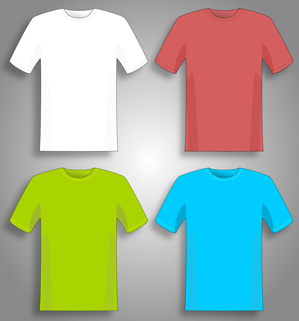
However, these 'pain points' may or may not be already recognized by the customer. For instance, a customer's need might be 'summer t-shirts'. Yet, they might not know specifically what color, material, or design of t-shirt they need, likely because they haven't looked into it yet! Just starting to explore the product page can lead them to discover needs and pain points they weren't aware of, possibly leading to an impulsive purchase.
Therefore, to convert these potential customers into actual customers, it is necessary to address and resolve their 'pain points' on the product page, while also convincing them with a 'unique selling point (USP)' that only your product can offer. (*USP: Unique Selling Point, means a distinct and unique advantage that a product has.) This USP should derive from the customer's pain points.
Grasp this USP well, reflect it in the content, and create a compelling, differentiated product page that convincingly addresses the customer's problems!
✔️ Action 1 : Organize and compare the information obtained from customer reviews or CS inquiries on paper or an Excel spreadsheet, and draw common themes.
✔️ Action 2 : If you have people around you who fit the target demographic for the product, asking them how they felt about the existing product page can be helpful.
✔️ Action 3 : By examining what parts are emphasized on the product pages of competing stores, you can quickly grasp the pain points of the target customers for that product category.
✔️ Action 1 : Write empathetic phrases on the product page copy as if you're having a friendly conversation with the customer. e.g., "You've been worried about sweating too much in public, haven't you?"
✔️ Action 2 : Emphasize from the top the content that the persona customer would be most curious about. e.g., "This is the highest quality protein created for those sensitive to digesting lactose protein."
✔️ Action 3 : Use a tone and terminology similar to that of your target customers in your ad banners and other copy. e.g., "I feel like I can't go out because my hair is a greasy mess... This is the lifesaver for those moments."
2️⃣ High Readability of Content

☑️ Structuring with a Story
The readability of content is a crucial factor that determines whether customers will stay on a product page or not. Customers generally don't want to go through the hassle of reading product descriptions. Therefore, it's essential to create a product page that is easy to read.
One effective way to achieve this is by structuring the entire product page like a story. Instead of just a simple advertisement leaflet, you can create a "problem-solving story" where a character experiencing some difficulties finds their pain points resolved and satisfaction through the product or service. Using this method, even a long product page can feel as engaging as reading a webtoon with a storyline.
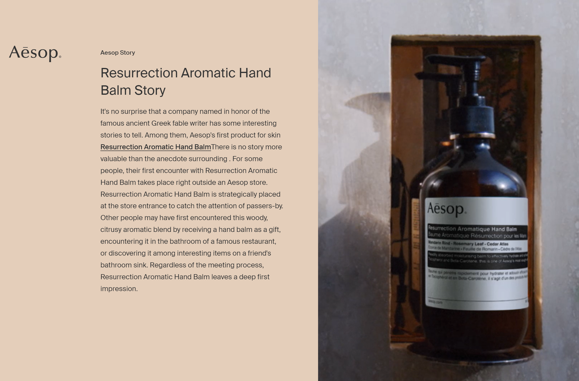
The first advantage of a story-based structure is that it makes the product page appear more like an interesting narrative about a character rather than an advertising page, encouraging customers to keep reading without leaving the page.
Additionally, even those who initially had no interest might end up reading to the end out of curiosity, potentially becoming prospective customers who remember the product.
For instance, you could structure the product page like a storybook, telling the tale of a customer struggling with flat feet who finds relief and reduced discomfort in daily life after wearing your "cushion socks".
☑️ Creating an Emotional Connection with Customers
The second advantage of a story-based structure is that it allows for an emotional connection with customers. People are generally overwhelmed with information from their smartphones, including SNS, YouTube, official news, and group chats with friends. Simply delivering information can feel stressful in such a saturated environment.
To prevent this, you can share emotional backstories about the product, including its development background and efforts made to solve customers' problems.
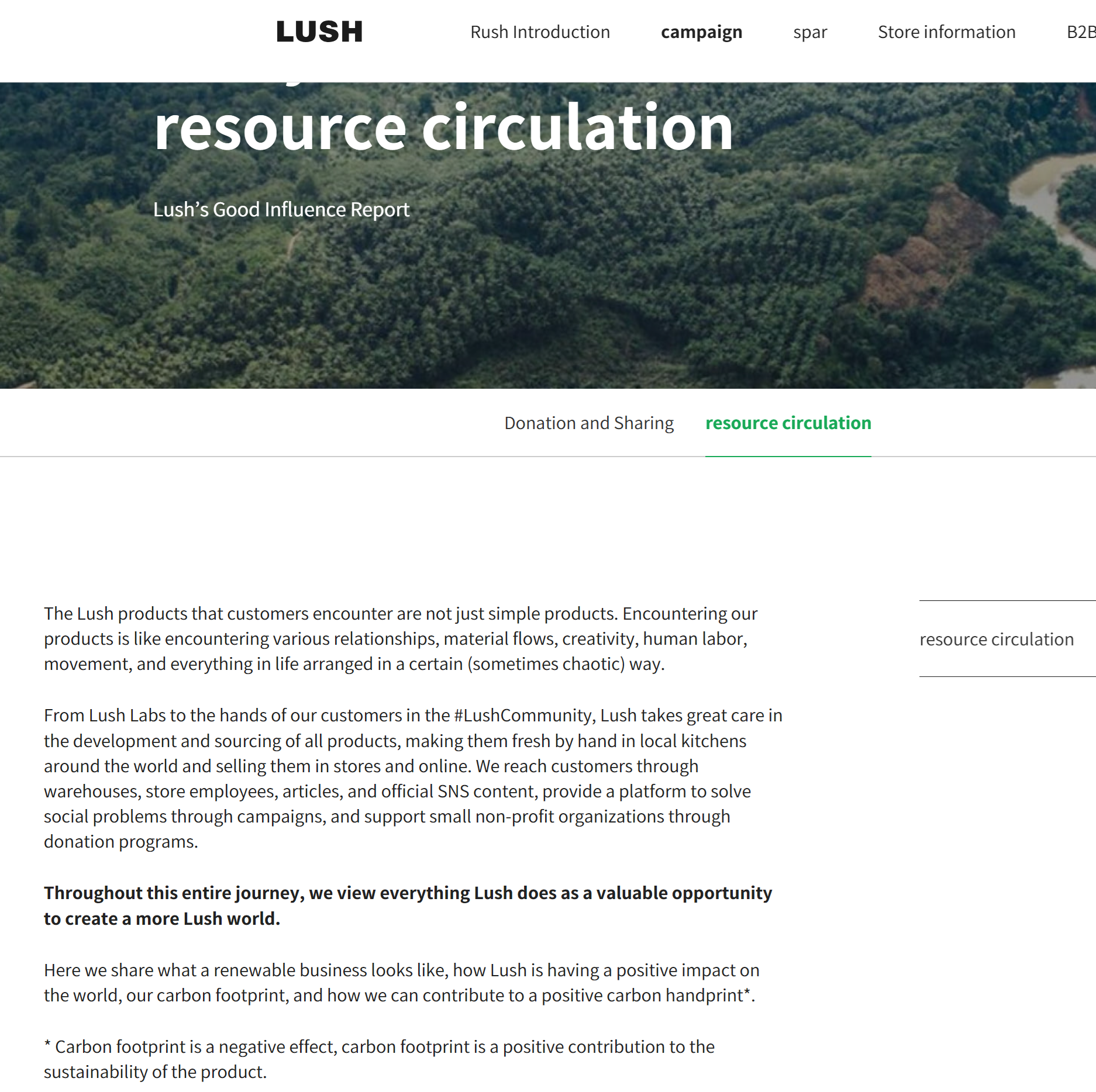
Although applying this method in its entirety might be challenging in some situations, it can be partially implemented or used as a reference during product planning. The greatest advantage of this approach is that it can turn customers into long-term fans of the product and brand, leading to a high "customer lifetime value(CLV)". (*Customer lifetime value refers to the total economic value a customer can provide during their lifetime relationship with a company.) Therefore, while difficult, it is a method known to the top 1% of sellers.
As product categories overlap more with competitors and competition intensifies, these emotional stories will become increasingly important. From a marketing perspective, building such stories is referred to as "branding". (*The importance of branding may vary depending on the product category and market characteristics!)
☑️ Taking Product Photos from Various Angles and Locations
When you first look at a product page, you tend to notice the images included, right? Customers are the same. It's better to provide visually rich content rather than just text.
High-quality photos are essential, but it's also important to include various product images taken from different angles and locations. This is because customers are concerned about how the actual product will look on them or in their space, and how it will appear up close.
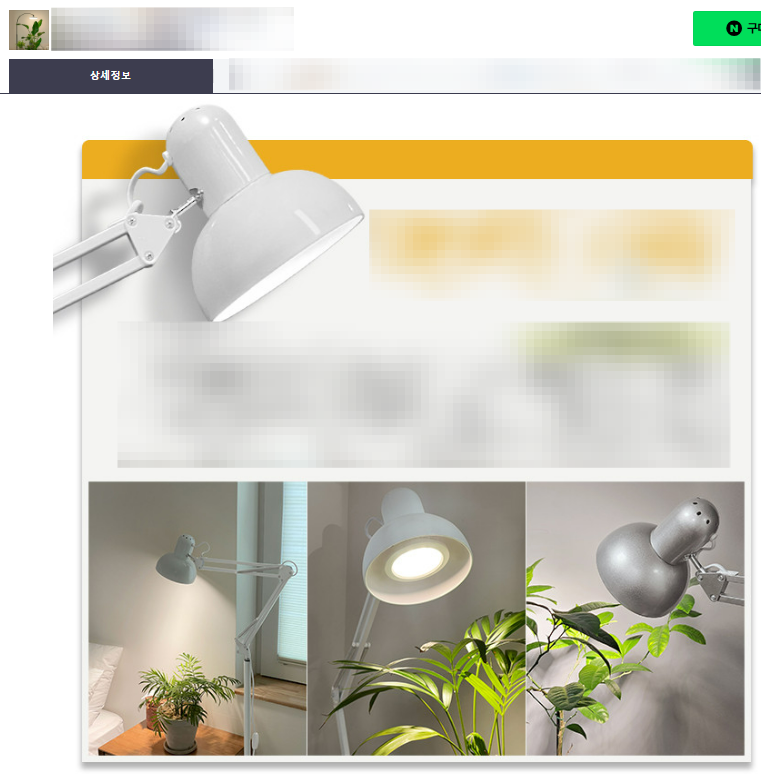
If you can clearly address these concerns, it will help with purchase conversion. Additionally, from an SEO perspective, including high-quality, diverse images can be advantageous for search exposure!
☑️ Reducing Unnecessary Text
Ever felt overwhelmed by too much text? On product pages, text is perceived similarly to images. Therefore, minimizing unnecessary text enhances readability and reduces the likelihood of customer drop-off. It's beneficial to emphatically focus on addressing the customer's 'pain points' rather than cramming in all the information.
Simplifying product feature descriptions at the bottom into concise keywords or neatly summarizing them in tables can boost readability. Arranging content primarily in single keywords, numbers, and short phrases rather than in paragraphs aids in readability.
Remember, in today's fast-paced society, customers' attention spans can be very short!
✔️ Action 1 : Start by placing a conclusion sentence at the very top about which pain points your product can solve.
✔️ Action 2 : Concisely express the core features and strengths of your product as if it were a slogan, e.g., "Hiking socks that stay comfortable even after 10 hours of use."
✔️ Action 3 : Organize additional features of the product in a bullet-point format all at once.
✔️ Action 4 : Enhancing the readability of your product page can also be achieved by showing actual usage or product shots at various locations through GIFs or videos!
3️⃣ Video Reviews: A New Strategy for Captivating Your Audience
☑️ Create a Video Review
In the modern era, we are bombarded with countless product advertisements daily, both offline and online. When the need for a specific product arises, we often turn to search platforms to look up information on items within that category.
However, in this flood of advertisements, capturing customers' attention with just text and images is becoming increasingly challenging.
Text and image reviews from actual customers can indeed help convert potential buyers on a product product page. Yet, if you aim to further differentiate and enhance the customer experience, consider creating video reviews. This approach was touched upon in our previous article discussing the use of review teams. (*Note: Be sure to obtain customer consent for marketing purposes and when repurposing reviews.)
Videos have a dynamic appeal that far surpasses that of static images, effectively capturing and retaining viewers' attention.
☑️ Transforming Review Images into Videos
If you've conducted a review event and gathered a substantial amount of customer feedback, consider converting these reviews into videos or GIFs.
[ Elence Customer Reviews, Created by 'VPLATE' ]
Humans are naturally drawn to moving objects. While beautiful, static images have their place, converting actual customer reviews into GIFs or videos for your product product page can unconsciously draw in potential customers. This method allows viewers to absorb a lot of information through a single video without the need to search through numerous reviews.
✔️ Action 1 : Collect customer review images with their consent and convert them into video format using the 'VPLATE' website.
✔️ Action 2 : Use the 'Convertio' website to convert these video formats into GIFs. (Be mindful of file size as large files can slow down page loading.)
✔️ Action 3 : Hire professional actors to create product review videos from a real user's perspective.
✔️ Action 4 : Sellers or representatives can also create videos showcasing their personal use of the product, offering another authentic review method.
This article presented three methods to create a differentiated and product page that not only captivates customer attention but also enhances conversion rates.
✔️ Conclusion 1 : Define your 'customer persona' clearly, understand their 'needs' and 'pain points', and reflect these on your product product page.
✔️ Conclusion 2 : Enhance content 'readability' and approach customers emotionally through 'storytelling'.
✔️ Conclusion 3 : Use 'video reviews' to increase product trustworthiness and create a more engaging product page.
✔ VPLATE experts will consult you on how to create short-form marketing videos that can be applied to the product page. Feel free to apply for a consultation right now.


