Hello! This is VPLATE.
Following the topic of our last article, "Product Page," we plan to cover the same theme in this article as well. Individual sellers must always have a lot on their minds. Not only is the design work a task, but figuring out how to structure the product page can also be daunting.
Therefore, the theme of this article is about specific methods related to the composition of the product page. We have included knowledge and information that we believe are essential for small-scale commerce managers and individual sellers, after much deliberation and research. We sincerely hope that sellers will gain practical knowledge and specific tips. Starting anything can be difficult, but if you achieve step by step, you will eventually find yourself at your destination! VPLATE will be with the sellers reading this article!
✅ Who Can Benefit?
- Solo sellers with limited budget and resources
- All-in-one marketers in the e-commerce industry
- Individuals planning and creating product pages on their own without external help
- Small business operators
✅ How Does It Help Specifically?
- You will gain a comprehensive understanding of product page composition.
- Concepts that were only vaguely understood before will become clear and concrete.
- You will get an in-depth look at the three most important elements of a product page.
✅ How Long Does It Take to Read?
- It takes about 19 minutes to read the entire article.
Let's start now! Are you ready to read?
The product page is absolutely crucial in the field of online commerce, you could say it's both the beginning and the end. Nearly all online purchases are made through product pages, as customers are drawn in, persuaded, and led to a purchase conversion. Therefore, it can be likened to the first impression one makes on a blind date. This means it's absolutely critical not to skimp on the creation of your product page. It takes about 3 seconds for consumers to form an overall perception of your product and brand from your product page. In other words, the product page is a key element directly linked to sales!
So, what elements make up a product page? As most people are accustomed to shopping on mobile, there are naturally some things that come to mind. The first things are large images of the product, impressive highlight copy, proof of superior quality, and even discount benefits. Yes, these are very important elements of a product page. To organize them a bit more specifically, they include:
- Product name
- Thumbnail images/videos
- Key visual product cuts / Model wearing shots
- Key features and strengths of the product
- Customer reviews
- Frequently Asked Questions (FAQ)
- Promotion benefits
- Instructions for use / Precautions
- Shipping information
- Social media links
- Product development story
- Brand design elements
We all know these elements exist, but when it comes to actually creating them, it can feel overwhelming, right? That's why, in this article, we're going to talk about what we consider the four most basic yet crucial elements: 1) Product name and thumbnail, 2) Customer reviews and data, 3) Promotional offers, and 4) The order of content. Let's dive in.
1️⃣ Product Name and Thumbnail : Determinants of the First Impression

✅ Product Name, Thumbnail
The product name and thumbnail are critically important for two reasons. First, from an SEO perspective, they help ensure that the product appears on the first page of shopping platform searches. Second, from the customer's standpoint, many decide in just 0.5 seconds whether to click based on the title and thumbnail alone. Therefore, these are key elements that require significant attention.
So, how should you go about creating advantageous product names and thumbnails?
Product Name Tips :
- Avoid keywords that are too common or too rare; selecting keywords with a moderate level of competition is advantageous.
- It’s beneficial to place important keywords toward the beginning.
- Based on stores that appear on the first page of Smartstore search results, many use 4-10 keywords.
- Pay attention to spacing; it's wise to do some comparative searches to decide whether to use spaces.
- Including specific and clear keywords like season, gender, material, purpose, etc., is recommended.
- Setting the same category as the top-ranked products for the selected keyword can give you an advantage in terms of relevancy.
- Don't miss any tags and attributes when registering the product! They're important for search engine algorithms.
- Tools like Naver Keyword Tool, Naver DataLab, Google Keyword Planner, Sumtrend, and Black Kiwi can be very helpful in finding popular keywords.
Thumbnail Tips :
- For Naver Smartstore, it's recommended to match the size to 1000 x 1000 pixels. However, if such a thumbnail is not available, adjusting to about 650 x 650 pixels is also acceptable.
- Avoid loud, eye-catching fluorescent colors or backgrounds, and complicated images!
- A clean background with a clear product cutout is appropriate.
- If you must include text such as logos or slogans in the thumbnail, use them within 20% of the total area!
- Considering the uniformity of thumbnails across various products, maintaining consistent placement or color tone and manner is beneficial.
- Set regular periods to update thumbnails with test products. This helps you find out which thumbnails generate higher click-through and conversion rates!
- Including short video thumbnails can also be really helpful! Top sellers often include 2-3 video thumbnails out of a total of 12.
✔️ Action 1 : Search the platform using the same keywords as the product you're selling.
✔️ Action 2 : Carefully observe what kind of thumbnails the stores appearing on the first page are using.
✔️ Action 3 : If there is a common composition, scene, or vibe from 1st to 10th place, use those elements right away!
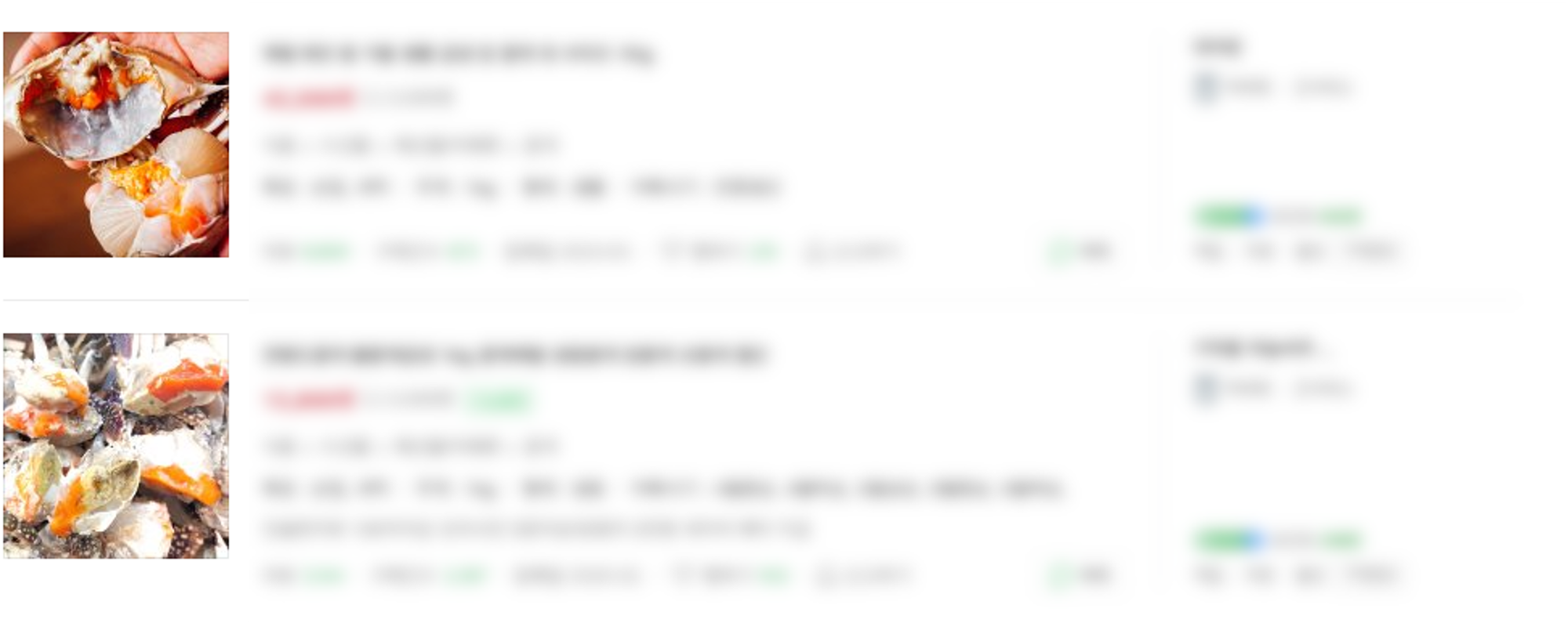
✅ Example : If, when searching for 'crab,' the thumbnails on the top 1st page show pictures of crabs with full eggs, it can be hypothesized that customers are looking for 'crabs full of eggs' when they search for crabs. Of course, you'll need your own differentiation strategy, right? Try using this method as a reference!
2️⃣ Customer reviews and data : Elements that increase credibility

✅ Customer reviews & Data
Customer reviews can be seen as a key factor that ultimately decides the final product purchase conversion. No matter how good the product is, if there are 0 reviews, it would be hesitant to make a purchase right away. On the other hand, if there are 300 real reviews left by actual users, even if you haven't heard of it before, you might find yourself empathizing with the majority's opinions and being persuaded differently than at first. Data is similar. It's not convincing to just say the product is good outright. It's important to present concrete 'why' it's good with experimental data or various evidence data. For instance, winning 1st place in a credible design competition could be an example!
- Customer Review Tip
- It's the most powerful element that can appeal to potential customers.
Reviews of real user experiences and pros and cons are much more persuasive than just the seller's product description. - Since many refer to reviews right before purchasing, it's essential to collect good reviews.
- In the beginning, there might be almost no reviews, so recruiting a trial group or commissioning product usage videos for a fee could also be a method.
- In the fiercely competitive online commerce market, purchase tendencies are ultimately determined by the accumulated reviews of users. People don't have much time or mental space to learn about newly launched products.
- It's the most powerful element that can appeal to potential customers.
- Data Tip
- Having a credible expert appear and vouch for the product also greatly helps in securing credibility.
- Writing down how much was sold, the quantity of purchases, and sales amounts can be more relatable.
- If it's early after launch and there's hardly any sales data, it's good to write down figures related to the product itself.
- It's good to include experimental data on how specific figures have improved before and after using the product.
✔️ Action 1 : Think about a promotion event that gives 500~1000 points for leaving a review.
✔️ Action 2 : Asking acquaintances to make purchases to gather initial reviews is also a good idea.
✔️ Action 3 : Join a paid trial group site and secure review content from professional real-use reviewers.
✔️ Action 4 : Sign up for 'Filmmakers' site and produce videos by recruiting professional actors as review users.
✔️ Action 5 : For low-cost products, running a 1+1 review event for about 10 to 100 products is also a method.
3️⃣ Promotion composition : The probability of purchase increases if there are discounts and gifts
✅ Promotion composition
Everyone has experienced at least once hesitating to buy a product they wanted because there was no discount or event. Our customers are no different. Unless it's a luxury brand that never goes on sale, naturally, a product that's cheaper and offers more benefits is more attractive. Therefore, it's good to place such promotions at the very top of the product page or right below the customer reviews.
From the perspective of preventing potential customer dropout, the importance of promotion can be understood by looking at the product page composition of currently successful companies. For instance, a cosmetics company O, which has recently gained significant popularity, has reflected the '1+1 special price' phrase directly in the title of the main product's product page. They even emphasized the '1+1' phrase in the thumbnail image and placed 'GIFT sample' benefits. (However, please check the thumbnail regulations for open markets or smart stores!)
This alone shows how much importance promotions have on the product page. Our customers are likely more curious about what direct and specific benefits and advantages a brand has among similar products rather than the product itself. Keep this in mind when composing the product page, and you'll surely witness sales increase in the long run.
✔️ Action 1 : Use an eye-catching Copy for promotion content. For example, 'Exclusive 15% special price for customers for just 3 days'.
✔️ Action 2 : When expressing with images, design the number of samples given or the discount rate prominently. ex) Enlarging '20% special discount' phrase
✔️ Action 3 : It's better to have 2-3 promotions rather than just one
4️⃣ Content Order : Reviews and customer persuasion are most important
Lastly, it's necessary to decide in what order to place the three key elements mentioned above and other product page composition elements. Let me tell you about the recent layout trend of product pages. Generally, the product pages of well-selling stores are composed in the following order.
- Visual intro
- Promotion benefit 1
- Product USP
- Customer reviews, various evidence
- Product description, detail images
- Promotion benefit 2
- Specific evidence data and certification materials
- Purchase inducing phrase
Do you feel something from looking at the core structure of the product page? Right. Up to 50% of the top scroll is focused on promotions and customer reviews. The recent trend in product page composition can be seen as reliable customer reviews and promotion benefits. In fact, startups K, Y, and V companies that are showing growth recently also composed their product pages in the same pattern. (Sorry for not being able to upload captures due to copyright issues.. 😭)
Therefore, sellers reading this article also need to seriously consider customer reviews and promotion benefits. However, once a certain level of product or brand recognition is built up, customer reviews may be excluded from the page composition. Instead, they replace it with concrete figures such as actual sales quantities or sales! To reach that level, a lot of effort and strategy will be needed. In the beginning, customer reviews are absolutely important, so it's good to think about how you can first collect customer reviews.
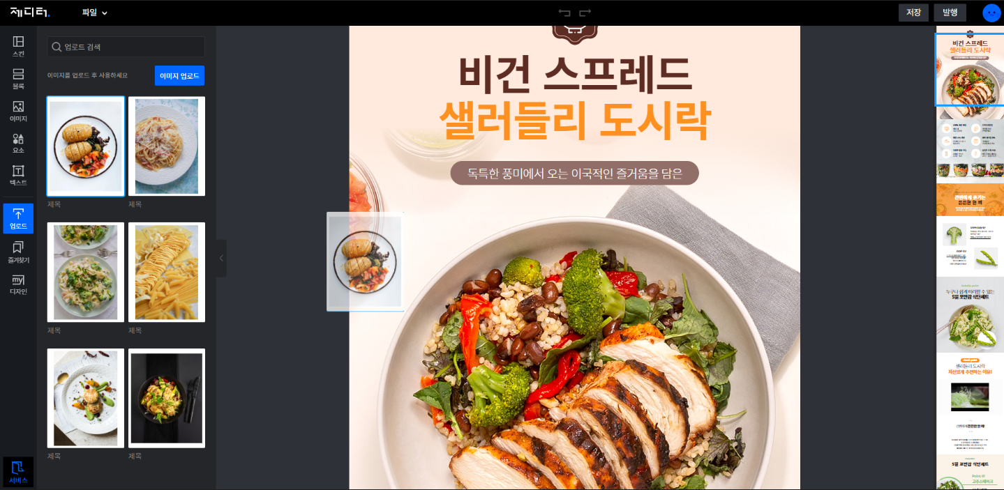
And besides the 5 product page production sites mentioned in the last article, I'll introduce one more site that can be a big help in producing product pages. It's called 'JEditor.' This site provides product page production templates and is organized so that you can easily adapt to the editor screen with a layout similar to 'Canva.' It's available for free, so if you really don't have time to produce right away, plan the composition first and then quickly complete the design using 'Canva' and 'Jeditor'!
✔️ Action 1 : If creating the entire product page by yourself is challenging, consider making images that contain customer reviews or promotional content and attach them at the top of the default product page images from wholesale sites!
✔️ Action 2 : If you don't have customer reviews yet, try organizing it by emphasizing promotions or review events at the top!
✔️ Action 3 : Try benchmarking the product pages of stores that appear at the top when searching with the same keywords as the product your company sells!
✔️ Action 4 : Looking at the product page composition of top-exposure stores in other categories can also be a big help!
The product page is a very important element in online commerce that decides the purchase conversion. In this article, we introduced effective ways to organize product pages for solo sellers and small businesses. Remember that the product name, thumbnail, customer reviews and data, and promotional benefits, and the order in which each element is placed can directly affect sales! Isn’t it fascinating that simply changing the order of page composition can reduce the customer dropout rate and increase the conversion rate, even without having to have incredibly fancy images? Through the strategies mentioned earlier, you will be able to achieve a high purchase conversion rate.
A differentiated product page includes things like video thumbnails. However, even making short videos is not an easy task. This is exactly when you can try the VPLATE solution for free.
✔ VPLATE experts will consult you on how to create short-form marketing videos that can be applied to the product page. Feel free to apply for a consultation right now.